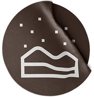
For the logo, I wanted to bring everything the company stands for into one mark. I combined a person sitting in a relaxed, mindful pose on a 4×4 in nature, representing both looking ahead to the future and reflecting on the past.
The colors and typography had to feel warm, adventurous, and natural. The dark brown connects to the earth tones of nature, while the orange captures that spark and fire you feel when heading out on an adventure.